
This page is a mish-mash of loose designs and notes. The logo sketches are very basic first impressions of the concept that will get refined over time. I've already decided that the caduceus, the winged Staff of Mercury, won't be part of the design. Why? A couple of reasons. First, up until the late 19th century the similar Rod of Asclepius (a snake wound around a walking stick or staff) was the accepted symbol of medical care. Conjecturally, the Sanitarium was founded before the change. Second, the caduceus has no historical connection to medicine, and it's adoption as a symbol was the result of a huge misunderstanding perpetuated by bureaucratic inertia. The Wikipedia article on the caduceus has an explanation of what happened.
You'll also notice some notes linking the Rod of Asclepius with the Yellow Sign. This is based purely on my own speculation that the inverted torch featured on the cover and spine of the initial printings of "The King in Yellow" is, in fact, the Yellow Sign. Here's a scan of the book from the Wikipedia article:

The symbolism of a torch consuming itself seems appropriate for the corrupting influence of Hastur in the Mythos. Outside of that, I think the inverted torch is a stylized depiction of the Yellow Sign, hence the notable lack of mass insanity among readers of the original book. The actual symbol looks like a tentacle (always with the tentacles!) spiraling around a spike- an almost perfectly inverted depiction of the Rod of Asclepius.
Finally, I started fiddling around with incorporating the Greek letter Psi, one of the symbols of psychiatry.
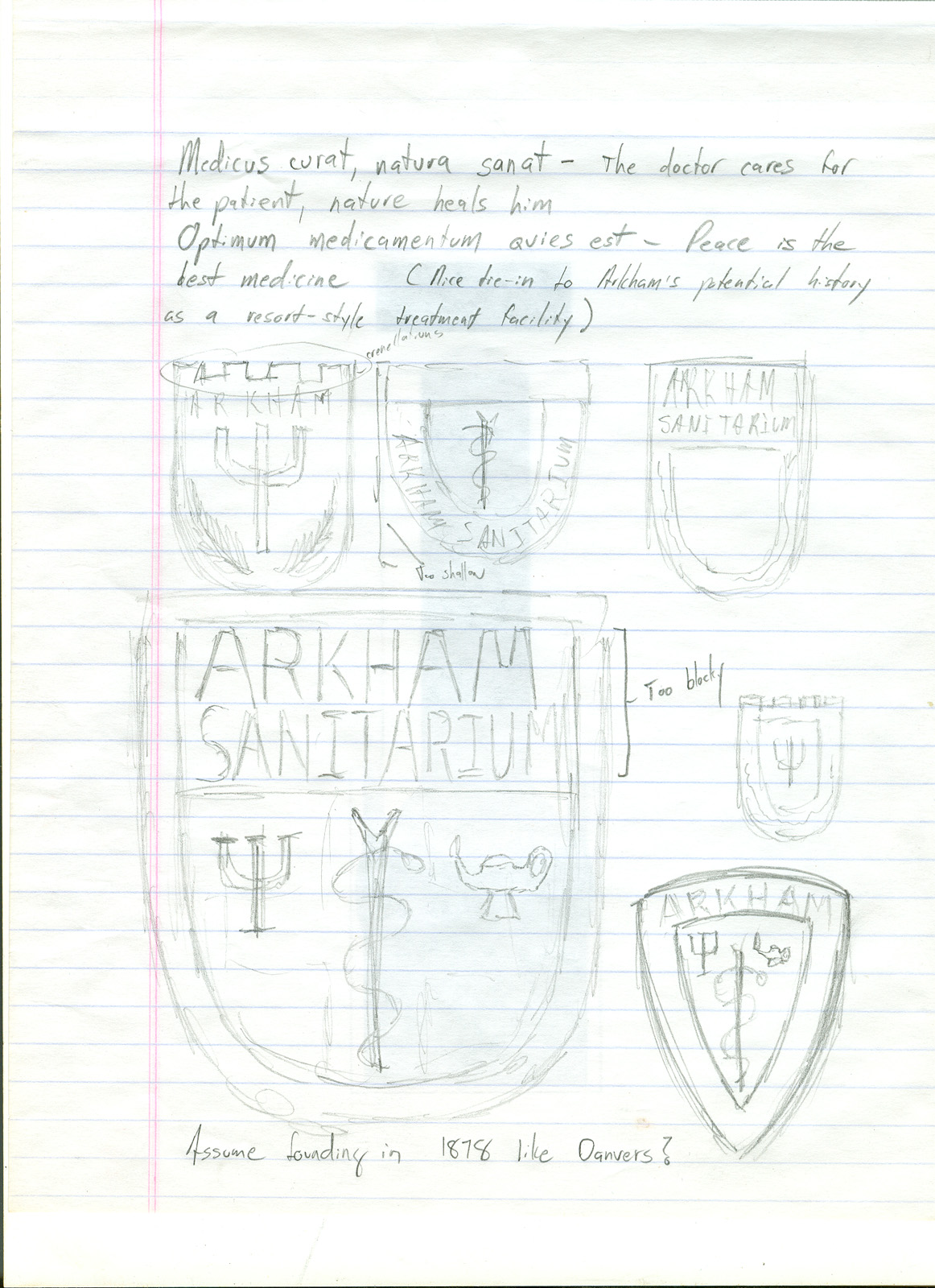
More rough sketches, with a couple of potential latin phrases. By this point I'm getting discouraged with my initial idea of having a shield shaped logo.

Some more iterations of the logo design. I've grudgingly returned to the round shape I wanted to avoid, but it certainly looks better than any of the shield designs. At the bottom are a few notes about how the accepted physical location of the Sanitarium in Arkham came to be. I'm increasingly convinced that both Lovecraft and Wilson drew on the history of the Dexter Asylum in Providence for that and other historical details.
There you have it- the rough beginnings of the Arkham Sanitarium project. With an emphasis on the "rough", as my misshapen sketches and horrifically bad handwriting attest. This is different from most pure design projects in that the attractiveness of the final logo isn't the sole criteria of success, at least to my mind. It also has to have a solid grounding in the history of both the real world and the fictional realm of the Mythos.
12 comments:
Should it be of any help, Here in the UK, I have seen the old hospitals often had a lozenge (diamond) shaped badge - thus losing the ubiquitous shield and circle designs.
The Cross of St John and the lamp were both popular symbols, though the Royal Masonic Hospital has the compasses and square of the Masons in its heraldry.
Hope this helps,
Ally
Hooray! New Badge/Patch/Notebooks coming!
@ Alysson
Thanks for the pointer. I've started looking at some of the vintage English hospital designs.
@ drjon
That will definitely be part of the project, but I think you'll be surprised at what else it will include.
http://www.fleurdelis.com/shields.htm
Of interest, perhaps.
I was wondering if the future could possibly have vitreous enamel in store. I don't know exactly what extra trouble or costs it would bring, but the thought of it makes my teeth water, as they say over here.
I look forward to watching this project evolve (and pulsate, and ooze)!
I came to the same conclusion as you with assuming the symbol on the original printing of "The King in Yellow" was supposed to be the Yellow Sign. This was many years ago when I read it in high school. There is no proof that Chambers intended this or not, but I agree that the corrupted Rod of Asclepius seems to fit the bill quite nicely.
Hooray! Surprising surprise coming! ^___^
Just remember the "crossover" to the Batman fandom. With your attention to detail and quality there is bound to be a much higher demand for this than even you other highly-sought-after offerings...
Just wanted to comment. I applaud using 'Sanitarium' instead of Arkham Asylum. The Arkham Sanitarium is the official Lovecraft version per his stories. Arkham Asylum is what is used in those Batman comic books.
@ P. S. Mangus
Great minds, and all that. Heh.
@ Scott and Anonymous
More importantly, any mention of "Arkham Asylum" in the logo or it's support materials is likely to cause an avalanche of legal paper to shower down on me. Warner Brothers and D.C. are understandably protective of their Batman copyrights, so I'm definitely confining my efforts to a recreation of Lovecraft's Arkham Sanitarium.
@ Robbert Folmer
If I eventually get around to doing a pin it will definitely be colored cloisonne.
@Anonymous
Using "Sanitarium" instead of "Asylum" would be what I expect if only because of Prop's attention to detail. On the other hand, no one really believes that Bob Kane/DC came up with "Arkham Asylum" independently--after all, "Arkham" can be traced to one writer so far as I know, no matter how many have co-opted it since. And considering the tone of the original stories "Sanitarium" would have been wholly appropriate--I'd say DC insisted on the "Asylum" specifically *because* it could be trademarked...
That doesn't mean that fans wouldn't be interested in paraphernalia that references it's origins--some may even see it as desirable *because* "it hearkens back to the days before it became a prison and was subsequently renamed."
Fans can be rabid, and any reference, no matter how oblique, is subject to collection :-)
Fortunately, capital Psi is usually shown with only the central column serifed and reaching to the top, while the side strokes are curvilinear and don't reach so high -- a shape more congenial to a circular badge than the three-equal-stroked Psi you've burdened yourself with. I've sent you a .png of Symbola's Psi at 288 point for sample reference.
This curving-away side-stroke also leaves room for a serpent's head, if you want a serpent winding about the central column in emulation of the Rod of Asclepius.
As for mottos, may I suggest adding to the list for consideration: "mens sana in corpore sano" (a sound mind in a sound body)? Presumably a *sanitarium* should look after both....
Post a Comment