This is the first iteration, when I was still thinking of having a central design of the Rod of Asclepius with a psi symbol and lantern on either side. I inked the rod by hand and then scanned it in and converted it into a vector image. After doing a few sketches I finally found a shield design that didn't make the "Arkham Sanitarium" lettering look awkward.

The second iteration, with the Rod of Asclepius merged with the greek letter psi used to symbolize psychiatry and psychology. Looking at it now I think it's the best layout of everything I've tried. The curving arms of the psi nicely echo the shape of the shield, but the font is a little weak.

Third iteration, returning to the concept of using multiple symbols. The only thing I really like about it is the font. Everything else is pretty blah.

The fourth try. It's not working for me, and I think the motto is just a distraction.
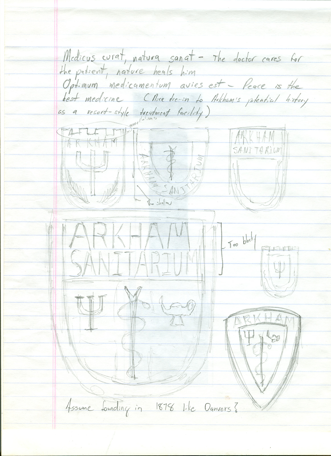
This is the part of designing things that I have a love/hate relationship with. I've come up with a few elements that work (the proportions between the shield shape and the lettering, the snake and psi design), but I've also gone through a ton of things that look terrible. That's one of the reasons I haven't posted any of the variations using wreaths or the multiple lamp designs I experimented with.
The one great thing about doing the work on a computer is that it's so easy to add and remove elements and move things around. Personally, I'm a firm believer in Sturgeon's Law- 90% of everything is crap. A computer isn't going to make you better at anything, but it's a miracle machine at letting you work through the 90% so you can get to the 10% that's worthwhile faster.