16sparrows, the proprietor of the "Behind the Curtain" blog, has a free pdf pattern for creating a valuable documents envelope.
This is the kind of paper prop that might as well have a big neon sign saying "Important plot information inside!" bolted onto it.
Thursday, April 30, 2009
Wednesday, April 29, 2009
Limestone Cthulhu Statue
Michaelao has posted a Cthulhu idol made from real limestone on deviantART. I get frustrated working with malleable sculpting materials, so I can only imagine the work that goes into stone carving.
You can check out some of his other work in the gallery, including a leather Necronomicon cover and hand-tooled armor.
Tuesday, April 28, 2009
The Land Down Under: Part Deux
Following up on my earlier efforts, here are a couple more design iterations for a patch based on Lovecraft's "The Shadow Out of Time".
This one makes a couple of minor changes from the last version. The font is a little cleaner and the Southern Cross design has been replaced by the stylized aboriginal journey/campsite glyphs.
Now we're cookin'. I really like how how this color scheme looks. Very evocative of the Australian desert, but the upper half of the design still seems a bit empty.
Oh, here we go. The sunburst really jazzes things up.
A little fiddling with the color scheme. Combine this with the sunburst design and we get...
I really like this. It has the clean geometric forms and color palette of a period design while incorporating some meaningful imagery. Ayer's Rock for Australia, the four parallel lines of the journey glyph running east to west, the concentric circles of the campsite glyph symbolizing both the destination of the expedition and it's actual rough location north of Ayer's rock, and the sunburst design recalls the sunburst in the Miskatonic University seal.
I'm going walk away from this for a couple of days and then see how it looks with fresh eyes, but I think this is pretty close to the final design.
Quick And Dirty Cthulhu Idol
Wesley Scoggins over at Indymogul has a tutorial up for creating a quick-and-dirty Cursed Idol using floral foam and paper clay.
I think Wesley shows exactly the right kind of attitude, even if he's not totally happy with his work. It's better to actually make something than to continually put off the attempt because you're afraid of failing. Of course you'll make mistakes. That's the whole point. Doing is always superior to dreaming because it allows you to make mistakes and learn from them, and the more mistakes you make the better.
One of the most important lessons I've ever learned is something I was taught by a truly talented artist- there's a whole lotta suck before you get to the good stuff. Embrace the suck, and learn from it, because it's the only way you're ever going to get better at anything in life.
Speaking of which, I should probably get back to trying to come up with a halfway decent Australian expedition logo....
"For your own creature you could do anything you want, and you don't have to follow my design at all, but I'm a Lovecraft nerd so it's pretty obvious why I picked this design. Any kind of simple design will do, very simple work could even be beneficial for a build like this since the simpler it is the older it can look, so don't doubt your sculpting skills here. I have terrible sculpting abilities and I put this together in about half an hour, so trust me when I say I know all you guys and gals out there can do better."
I think Wesley shows exactly the right kind of attitude, even if he's not totally happy with his work. It's better to actually make something than to continually put off the attempt because you're afraid of failing. Of course you'll make mistakes. That's the whole point. Doing is always superior to dreaming because it allows you to make mistakes and learn from them, and the more mistakes you make the better.
One of the most important lessons I've ever learned is something I was taught by a truly talented artist- there's a whole lotta suck before you get to the good stuff. Embrace the suck, and learn from it, because it's the only way you're ever going to get better at anything in life.
Speaking of which, I should probably get back to trying to come up with a halfway decent Australian expedition logo....
Lights! Camera! Action!
As part of his efforts to produce a Lovecraftian short film Jason Heath has created some great props, including this journal from "At the Mountains of Madness":
And a very impressive Cthulhu idol:
You can read more about his efforts at the "Rebel Café" indy filmmaking site, or at his blog.
And a very impressive Cthulhu idol:
You can read more about his efforts at the "Rebel Café" indy filmmaking site, or at his blog.
Monday, April 27, 2009
The Land Down Under
I've been fooling around with some possible designs for another Miskatonic patch, this time for the 1935 expedition to Australia from "The Shadow Out of Time". So far, I haven't had much luck coming up with something I like. I know I don't want to use a silhouette of Australia, or, god forbid, a kangaroo, but beyond that I'm not feeling very inspired.
It's bright! The lines and concentric circles are a stylized version of the aboriginal symbols for a journey and campsite, while the stars are the Southern Cross found on the Australian flag. I think this depiction is a little too modern.
Same design, slightly different color scheme. A step up, but that's not saying much.
I like the colors, but I think the use of the rough version of the travel and campsite symbols doesn't quite work.
Now we're getting somewhere. Ayer's Rock is a natural symbol for Australia, and the two-color cutout presentation is consistent with period advertising graphics. The latin Ab Aeterno, "From the beginning of time", gives a nod to the expedition's mission to explore ancient ruins, as well as serving up a bit of meta-irony to anyone familiar with the story.
The lettering looks better thanks to a few tweaks, but I don't think using the "campsite" symbol in a rising sun motif works. I really like the buffed-up Ayer's Rock.
I'm liking this, although I have some doubts about the reverse-arch effect on the latin motto.
It still needs work, but I think I'm on the right track. In addition to figuring out the final graphics I also have to decide on the titling. Should it be the "Australian Expedition", or the "Peaslee-Boyle Expedition", or the "Great Sandy Desert Expedition"?
Your thoughts, as always, are appreciated.
Sunday, April 26, 2009
The Ravages Of Time
I'm probably one of the very few artists (and I use that term in reference to myself very loosely) who loves seeing his work used and abused. Brian Stillman did an excellent job of weathering one of my Miskatonic expedition patches, and was kind enough to send this before and after comparison along with detailed instructions.
"Aging it was pretty simple and straight forward. First, I attacked it with a small file, roughing up all the edges and just fraying the heck out of it. Then I took an X-acto knife and made light, quick slicing motions all over it. This loosened up all the threads, which I then just picked at until I had the right amount of wear. Through it all, I used some patches from my father's old army jacket as references.
I also used the knife to cut away some of the plastic backing -- this allows the patch to curl and warp a bit more.
Finally, I soaked it overnight in chai tea. It's a bit lighter than straight black tea, which was closer to the look I wanted. Plus, it gave the patch a nice cinnamon-y smell, which covers the stench of pure evil that had otherwise permeated it. :) "
Saturday, April 25, 2009
Friday, April 24, 2009
Sold Out
Thanks to everyone that ordered patches or photo sets from the latest run. As of an hour ago I'm sold out.
The Book Of Time
As part of the "Epilog Challenge", gmjhowe has posted a nifty tutorial on how to create "The Book of Time" at Instructables. It's an incredibly detailed look at crafting an interesting tome using very simple tools and materials. Here's his video showing off the finished product:
Thursday, April 23, 2009
Off Topic: Heavy Traffic
Since the subject has come up I wanted to share some of the blog's traffic stats from Sitemeter. Click through for the higher-res version.
This month is on track to be a record breaker for Propnomicon, thanks to the combination of a mysterious burst of traffic that started about six weeks ago and my shilling the latest run of Miskatonic loot. Record breaking, in this case, being relative. Believe me, I'm overjoyed at the thought of having 3000 visitors in a single month, particularly when compared to the 37 I had for all of April 2008.
I know more mainstream sites with those numbers would be weeping and gnashing their teeth, but for an ultra-niche blog like this it's all gravy. My whole schtick is about making and sharing cool props with people that appreciate them and, hopefully, helping people make their own. Having an audience, no matter what it's size, is secondary to that idea. I'm glad people keep coming back, but I'm even happier when they drop me an email saying they used a prop document from the blog or finally got around to making some props of their own. It's the "making" that matters, not the viewing.
Update: Here's a look at the site's traffic stats up until the last day of July, 2009.
Trash To Treasure
Chris Bartlett is a very talented artist and costumer known primarily for his work recreating the costumes of Star Wars. But he also bangs out some impressive side projects, like this ancient artifact built from bits and bobs about the house:
He's posted a full tutorial on Flickr that features a detailed look at it's construction and tips for making your own.
I knew I should have bought that hamster ball at the Goodwill shop yesterday.
He's posted a full tutorial on Flickr that features a detailed look at it's construction and tips for making your own.
I knew I should have bought that hamster ball at the Goodwill shop yesterday.
Wednesday, April 22, 2009
The Necronomicon: Ustino Edition
Venetian artist and bookbinder Dario Ustino appears to have done something that I thought was close to impossible: produce a full prop version of the Necronomicon. I might quibble about some of the details, but the level of craftsmanship and dedication required to produce work like this is astonishing.
I love the use of traditional occult imagery here on the cover, but I think the gold title is a bit overpowering. The weathering on the leather is wonderful.
More masterful distressing. Not too much, not too little, just right.
I think this close-up reveals some of the details of how the weathering was done. From the look of that sinuous brown stain on the right I'd guess that he used the soot and flame from a lit candle to create it. The pattern of wear on the left looks like a rag saturated with charcoal dust was rubbed over the paper and then the excess wiped away. I love how both approaches brought out the texture of the handmade paper.
Another figure decorates the back cover. The layered leather approach is something I would never have thought of, but I like how it looks.
Based on the prices for the traditionally rebound books Mr. Ustino sells on the linked page I can only imagine how much this Necronomicon would sell for. The hours of labor required to detail each and every page boggles the mind.
Tuesday, April 21, 2009
Mirror, Mirror, On The Wall
Rev. Marx has a handy tutorial up on etching glass. Just the thing for the cultist with a DIY streak.
Monday, April 20, 2009
The End
Well, the end is in sight.
In August of last year I came back to pen and paper gaming after a long absence to be part of a group running through Chaosium's "Beyond the Mountains of Madness". We'll be having our final session in two weeks time, but my part of the journey is over. It ended in an ancient city high upon the Antarctic plateau, where I, like hundreds or thousands of others over the years, was forced to make a difficult choice. If you've made the same journey, you'll know what I mean when I say that that I did the right thing for the greater good.
After hearing how great BTMOM was for years I finally learned the truth for myself. What an incredible, memorable experience. Yes, it has it's flaws, but it also has a truly epic climax that more than justifies the praise it's received.
My experience creating props based on "At the Mountains of Madness" has been running parallel to running through BTMOM, and it too is coming to a close. Last year I produced my first run of 100 patches for the Miskatonic Antarctic expedition and they sold out in a week. Since then I've been producing a pretty steady stream of material and I think I'm close to having every major item mentioned or implied in the story covered.
Miskatonic University expedition patch? Check.
Photographs salvaged from the ruins of the Lake encampment? Check.
Drawings made by Danforth and Dyer as they explored the Elder Thing city? Check, check, check, and check.
Operational diagram of Pabodie's revolutionary drilling rig? Check.
Dyer's pilot's license? Check.
Manual mock-up for the expedition's Dornier-Wal aircraft? Check.
Large-scale, period map of Antarctica? That was going to be my follow up project to the initial run of patches, but as I explained over here there just wouldn't be enough demand to justify the cost of the print run. Even that isn't a major gap, since the link provides information on how to purchase a very reasonably priced copy of the 1922 Bartholomew map mine was based on.
Is there anything else I've missed? The only thing I'm aware of is one of the Elder Thing's soapstone starstones. I'm planning on making one for myself to fill out the "From the Mountains of Madness" case, but that's the kind of project that anyone with a little time and some Sculpey can whip up.
If you can think of anything, particularly paper props, please leave a comment and I'll see about rustling something up.
Oh, and one last thing.
In Memoriam...
Richard Allen DeVost
1902-1934
At the bottom of the world
he gave his all
for the greater good.
In August of last year I came back to pen and paper gaming after a long absence to be part of a group running through Chaosium's "Beyond the Mountains of Madness". We'll be having our final session in two weeks time, but my part of the journey is over. It ended in an ancient city high upon the Antarctic plateau, where I, like hundreds or thousands of others over the years, was forced to make a difficult choice. If you've made the same journey, you'll know what I mean when I say that that I did the right thing for the greater good.
After hearing how great BTMOM was for years I finally learned the truth for myself. What an incredible, memorable experience. Yes, it has it's flaws, but it also has a truly epic climax that more than justifies the praise it's received.
My experience creating props based on "At the Mountains of Madness" has been running parallel to running through BTMOM, and it too is coming to a close. Last year I produced my first run of 100 patches for the Miskatonic Antarctic expedition and they sold out in a week. Since then I've been producing a pretty steady stream of material and I think I'm close to having every major item mentioned or implied in the story covered.
Miskatonic University expedition patch? Check.
Photographs salvaged from the ruins of the Lake encampment? Check.
Drawings made by Danforth and Dyer as they explored the Elder Thing city? Check, check, check, and check.
Operational diagram of Pabodie's revolutionary drilling rig? Check.
Dyer's pilot's license? Check.
Manual mock-up for the expedition's Dornier-Wal aircraft? Check.
Large-scale, period map of Antarctica? That was going to be my follow up project to the initial run of patches, but as I explained over here there just wouldn't be enough demand to justify the cost of the print run. Even that isn't a major gap, since the link provides information on how to purchase a very reasonably priced copy of the 1922 Bartholomew map mine was based on.
Is there anything else I've missed? The only thing I'm aware of is one of the Elder Thing's soapstone starstones. I'm planning on making one for myself to fill out the "From the Mountains of Madness" case, but that's the kind of project that anyone with a little time and some Sculpey can whip up.
If you can think of anything, particularly paper props, please leave a comment and I'll see about rustling something up.
Oh, and one last thing.
Richard Allen DeVost
1902-1934
At the bottom of the world
he gave his all
for the greater good.
Sunday, April 19, 2009
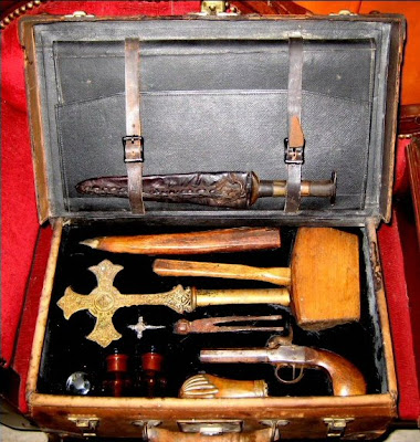
For The Well Equipped Vampire Hunter
Another "authentic" vampire hunting kit recently popped up on Ebay. I liked the overall presentation, and the use of something other than an old flatware case to hold everything, but I was stunned when it sold for for an unbelievable $3000. Here are some pictures of the kit. Just click through for the full sized versions.
Saturday, April 18, 2009
The Dyer Sketches- The Walls
Here's a look at the final Dyer sketch I've commissioned- Lake and Danforth examining the carvings on the walls of the Elder Thing city.
Once again, Danny Cruz has outdone himself. I've commissioned artwork in the past and had some less-than-optimal experiences, but dealing with him on this project has been an absolute joy. The quality of his artwork speaks for itself, he has consistently come up with clever visual solutions for solving my sometimes vague editorial suggestions, and he's been exceedingly polite and prompt in all our dealings. Based on my experiences working with him I sincerely hope that his artwork will grace more than a few of Chaosium's "Call of Cthulhu" projects in the future.
Friday, April 17, 2009
Arcanum De Profundis Prop Book
The talented Mr. Able of The Able Workshop has produced an amazing prop tome: The Arcanum De Profundis.
What an incredible piece of work. The tome itself is impressive, but I'm equally in love with the excellent craftsmanship and weathering on the storage box. Wander around his site and you'll find other projects of interest, including a hand-bound copy of the "Nine Gates of the Kingdom of Shadows".
Thursday, April 16, 2009
Anchors Aweigh
I'm currently working on a period copy of the shipping articles, the contract between a sailor and a boat's owners. I scanned in a copy of the original, but no matter what I do I can't get a decent OCR read off the text. That means I have to type a lot of it manually. Hopefully I'll have it finished in time to post on Friday, or possibly Saturday.
I'm expending so much effort into finishing it because it's the kind of prop document that would be particularly useful in a "Call of Cthulhu" game. Lovecraft country has a rich seafaring culture, and copies of the shipping articles archived in towns like Arkham and Innsmouth could be a valuable source of information to investigators.
Wednesday, April 15, 2009
Da Starz R Rite
Frankly, I'm ashamed of myself. I've always hated "cute" mythos memorabilia, but something came over me last night. After over a year of cranking out serious, reality-based stuff I finally succumbed to the siren call of the dark side.
The sad thing is I'll probably sell more of these things on Zazzle than my Miskatonic Expedition stuff.
Prop Luggage Labels
Considering how much I love ephemera from the 20's and 30's I'm surprised it's taken me this long to discover Dover's Old-Fashioned Luggage Labels (Stickers), a collection of reproduction stickers based on the advertising labels slapped on luggage during the golden age of travel. The book features four full-color plates filled with 53 vintage travel stickers from the 20's to the 50's, but with a few exceptions (like TWA and Intourist Leningrad) they're all appropriate for use during the "Call of Cthulhu" era.
There are a few airline and cruise ship logos scattered throughout, but most of the stickers feature hotels. Among the more notable ones are:
The Grand Hotel, Rome
Victoria Hotel, Amsterdam
Hotel Luna, Venice
Hotel Wildenmann, Lucern
Tarbet Hotel, Loch Lomond
Hotel Lido, Bucharest
The Continental Savoy, Cairo
Palace Hotel, Brussels
Grosvenor House, London
Hotel Mamounia, Marrakesh
Continental Palace, Saigon
Semiramis Hotel, Cairo
Hotel Fast, Jerusalem
Hotel Schwarzer Bock, Wiesbaden
The print quality is excellent, capturing the details of the masterful design work that went into all these images. The only thing I didn't like is that the stickers aren't reproduced full-size. Period stickers were 3" across or larger and most of these look like they were scaled down 80% or more. Since this book is aimed at scrapbooking enthusiasts it makes sense to shrink them so they don't overpower a page, but I wish the description on Amazon had been more forthright about the actual dimensions.
That said, I'm still happy with the book. For just $5.95 it's a great resource that features some wonderfully evocative artwork, particularly if you're running a globe-spanning campaign like "Masks of Nyarlathotep".
(Purchasing from the Amazon link above throws a couple of dimes in my account and helps support my book-buying addiction. I got a monkey on my back, bro.)
One For The Shippers
No, not the kind of shippers that imagine romantic relationships between the characters in their favorite shows (although I find the thought of John Connor hooking up with Cameron the smokin' hot Terminator strangely intriguing), but the ones involved in the package trade. Cephalopod Productions has posted a very cool period shipping receipt.
Tuesday, April 14, 2009
It Must Be My Clean Living
I'm not sure why, but my site traffic has blown through the roof over the last few weeks. In terms of visitors, this month has already topped February and is well on it's way to surpassing last month's figures. The increase in page views is even more dramatic.
Mind you, the numbers are still pretty small in comparison to most sites. If I'm lucky I'll hit just over 2000 unique visitors this month, which is equal to less than one second's worth of traffic at a major website. Still, I think that's a respectable number for a blog that services a niche (people interested in propmaking) of a niche (Call of Cthulhu players) of a niche (roleplaying and live action gamers).
Whatever the reason, thanks. I'm glad that at least a few hundred people find my stuff interesting enough to visit on a regular basis.
Update: Ironically enough, today's traffic has already broken my previous record of 114 visitors in a single day. Yeah, I know that in the big picture that isn't much, what with blogs that concentrate on Paris Hilton's vagina generating a thousand times as much traffic, but to me it means a lot.
Monday, April 13, 2009
Free Custom Fonts
One of the problems encountered by propmakers trying to create arcane tomes and scrolls is finding appropriate fonts. There are hundreds of exotic fonts floating around the net, ranging from ancient writing systems to custom alphabets created by conlang enthusiasts, but it can be difficult to overcome the issue of familiarity. Sure, the average person wouldn't recognize a stylized handwritten version of Tolkien's Tengwar, but there's a pretty good chance that the average gamer would. Heck, he might even be able to read it.
One way to get around that limitation is to create your own font using unique glyph designs. Up until now that required either some expertise in using graphic programs or a chunk of cash to pay someone else to do the work for you. Luckily, you can avoid either option by using the free Font Generator. Just download the form, write or draw your font characters, scan the sheet in and then submit it to the website and they'll spit out a brand new, custom font to your specifications.
That, my friends, is an amazing bit of technology. And I imagine some of you are already thinking up ways to use it.
Generic Critter Clip Art
Sunday, April 12, 2009
Clockwork Occult Circle
Saturday, April 11, 2009
Famous Last Words
A kind emailer pointed out that my Miskatonic University logo was used in one of the finalist's entries for Fantastic Horror's "Famous Last Postcards" contest. All of the entries are pretty amusing.
Friday, April 10, 2009
The Ponape Scriptures: My Edition
With all this discussion of tomecraft I thought it would be appropriate to share some of my own efforts. All of these pictures are from a small run of about a dozen copies of the "Ponape Scriptures" that I did around ten years ago. I thought I'd lost all the pictures I'd taken of them, but I discovered these shots on an old memory card a few months ago. That should help explain both their small size and poor quality.
One of my better cover treatments, featuring hand tooled sheet copper and flame-aged wood. The copper was patinated with a mixture of ammonia and salt water.
A closeup of the cover embossment. The copper was attached to the cover using brass brads.
An alternate cover embossment using un-aged copper. The Cthulhu sigil on the cover was one I came up with while trying to mimic some of the design elements of art from the South Pacific using the tribal-styled Tatooz font. Most of the artwork rearranged bits and pieces of that font to create the dozens of illustrations, such as they were, that I needed to fill the book.
This shot gives you a look at the the alternative binding I used for a few copies.
Interior pages, with a good shot of the Cthulhu sigil. As you can see, the pages had a very light aging treatment. That tendency to under-weather props is something I've had trouble with for years because of my fondness for neatness and cleanliness. It's not quite at the level of suffering from OCD, but it's definitely had a negative impact on my propmaking efforts.
I need to embrace the dirt. Heh.
One of the summoning circle designs.
I believe this was the Dagon sigil.
Another summoning circle.
I can't even remember what this one was supposed to be.
With the distance of time I can see a lot of flaws in these, but I think that overall the Scriptures project was a decent effort. The biggest problem with it is that most of the illustrations are only mildly reworked and recombined symbols from the Tatooz font, something that I'd be loathe to do today. There's a line between inspired and derivative that this project's artwork definitely crossed.
The weathering treatment is also far too light. As I've done more prop artifacts over the last few months I've grudgingly begun moving towards adding more extreme distressing to items. I've even posted a sign saying "More Dirt! More Grime! More Wear!" above my workbench as a motivational tool. I know it sounds weird, but it takes a major effort for me to really dirty things up the way they should be. I know intellectually that they'll look better that way, but my innate psychological aversion to dirt seems to apply even to fake filth.
Thursday, April 9, 2009
The Necronomicon: Launet Edition
As mentioned yesterday, there's one artist who I think has truly captured the look and feel of the Necronomicon- Francois Launet. His whole site is filled with incredible artwork, but if you visit the "Goomicronicon" section of his gallery you'll find his unique interpretation of the Necronomicon's pages. His approach draws on real-world inspirations like DaVinci's journals, but adds a wonderfully evocative sense of the arcane and alien.
This is the artwork I see in my mind when I think of the Necronomicon, and when I win the lottery I'll be spending a significant portion of my winnings to have Launet create the illustrations for the Uber-tome I've always wanted.
Wednesday, April 8, 2009
The Necronomicon: Sauber Edition
One of the holy grail props of Mythos fans is the Necronomicon, the infamous tome of forbidden knowledge. It's Lovecraft's most well known creation, outstripping even Cthulhu himself in terms of awareness thanks to it's widespread appearances in popular culture. To date, I don't think anyone has created a fully realized copy. There have been numerous prop versions featuring some incredible bookcrafting and a limited number of pages, but the immense amount of original artwork the project would require is a stumbling block that isn't likely to be overcome anytime soon.
In the meantime we can still enjoy the prop versions that are floating around, like this one created by Pete Sauber for a production of the "Evil Dead: Live!" stage show.
Update: The discussion in the comments has reminded me that I've somehow failed to link to what I think is the single best depiction of the Necronomicon ever created. I'll correct that oversight tomorrow.
Tuesday, April 7, 2009
Our Finest Hour
If you're running a WWII era game you'll find a plethora of prop paperwork over at Hardscrabble Farm. The site's collection of military ephemera is intended for historical reenactors, but I can think of a lot of ways they could be incorporated into scenarios. Just looking at the transit passes, signal corp envelopes, and explosives labels (!) brings to mind all kinds of possibilities.
Browse around the site and you'll also find some great WWII and Civil War era prop photographs.
Subscribe to:
Posts (Atom)