Here's the original I'm basing it on- a Harvard pennant from the early 20's.

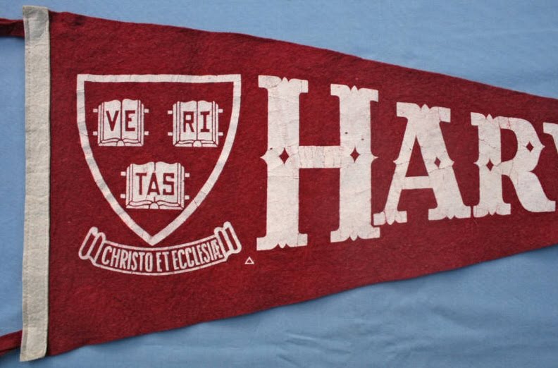
The repro pennants will be very close to this one in construction, with white printing on a red felt banner. The body will have a white felt strip sewn on the edge so you can mount it on a dowel and hoist it at your favorite sporting event, if you're so inclined.
The font used is a custom Tuscan that I haven't been able to find a freeware equivalent for. Reproducing it by hand is a possibility, but the "IFC Insane Rodeo" font by Anton Krylov is very similar to the original. Close enough that I'm in the process of getting a commercial license so I can use it for the project. It's not a perfect match, but it captures the stylized look of the original without edging too far into the circus or western look.

3 comments:
I find this freeware font closer to the original
http://en.fonts2u.com/anderson-four-feather-falls.fuente
That looks very nice.
The typography looks off however. In the original every letter is smaller than the previous. In the digital mock-up, it looks like you automated it.
I hope I explained it clear enough.
I am loving the pennant!
Post a Comment