"The lid of the coffin allows viewing of the inner passenger to those who look closer. The lid is also hindged and opens up to reveal the chains that keep the bone in place. The whole thing (minus the bone) was Patinated black. I went back with a brass brush to soften the finish, and used a polishing wheel to wear down the edges. The idea was a worn piece that has been around for a long time."
Sunday, October 31, 2010
Reliquary
Artist Kenneth Webb brings us this phenomenal copper and brass reliquary.
Saturday, October 30, 2010
Piper of Azathoth
It's the day before Halloween and you don't have a costume. Matteo Bocci just might be able to help with this look at how to build a tentacled Piper of Azathoth. The post is in Italian, but Mr. Bocci was kind enough to send over a translation.
"I played a “Cthulhu Live” session back in 2000, and I had the opportunity to create a cthulhoid puppet representing one of the flutists who play blasphemous melodies before the throne of Azathoth. Ten years later, the live and the puppet are back, revised and corrected.
The costume is mounted on an armor constructed of PVC pipe and scraps of metal mesh usually used for fencing, all held together by glue, string, and hopes ... Hopes fortunately well placed, since the structure has held up without collapsing on one of my friends who heroically volunteered to drive the beast (thanks, Luca !!!).
The head and front of the creature are made of papier mache on a base of foam, kept in shape with string tension. The eyes are two frisbee properly painted, which are glued on the two half-spheres (found in potato chips years ago). The wattles of the beast are in cloth, with the addition of some detail in paper mache. The many tentacles are made from transparent plastic bubble-wrap. Everything was then painted with the dry brush technique.
Unfortunately, due to the limited space available and the difficulty of transporting the costume, I had to opt for simple pieces of cloth dyed with bleach to cover up the armor and the "pilot" of the creature, giving up (even due to time matters) the idea of making a more defined body shape.
The final effect, considering also the low lights during the game, was still great.
The face of the beast and its tentacles are painted with a layer of phosphorescent paint, completely transparent to light but glowing in the dark."
Friday, October 29, 2010
Passport to Adventure
Greg Oakes sent over a link to a feature on classic era archaeologist James Henry Breasted that features some beautiful passport scans and period photography.
If I have some time this weekend I'm going to try recreating some of the passport stamps. The resolution of the scans is a little low to isolate them and lift clear copies.
"At Archaeology Now there is an article with accompanying photographs describing archaeologist James Henry Breasted's 1919-1920 journey through the Middle East. Accompanying this is a set of photographs of Visa and entry stamps, letters of introduction etc that I thought you might be interested in – I see a great Jackson Elias passport prop in the offing!"
If I have some time this weekend I'm going to try recreating some of the passport stamps. The resolution of the scans is a little low to isolate them and lift clear copies.
Sacrificial Dagger
Artist Daniel O'Keefe brings us this well done sacrificial dagger. The design is fantastic, but it's the patina and distressing that really brings it to life, so to speak.
Thursday, October 28, 2010
At the Mountains of Madness Dream Casting
Guillermo Del Toro says he'd love to work with Hugh Jackman in this interview.
The mention of James McAvoy or Tom Cruise starring in "At the Mountains of Madness" didn't excite me, but Hugh Jackman playing William Dyer? I'm there.
Not that anyone asked me, but I'd like to see Ron Pearlman as Frank Pabodie (getting rid of the superfluous "Larson" character in the leaked script), McAvoy as Danforth, and Anthony Hopkins or Ciarán Hinds as Prof. Lake.
Arachnid Under Glass
Artist Tóbal brings us this very nice vintage style bottled specimen of Argiope lobata. A totally harmless breed of spider, but it's still creeps me out more than a fantasy specimen.
Wednesday, October 27, 2010
The Nazir, Redux.
A few weeks ago I posted a photograph of Jacob, son of Aaron, the Samaritan high priest of Schechem, for use as a prop in conjunction with the "Masks of Nyarlathotep" adventure.
Amazingly, Raven discovered a letter from Jacob that was published in "The Open Court" magazine back in 1907. The contents are a discussion of biblical history and prophecy based on Samaritan messianic traditions. It's not prop related in the slightest, other than serving as an example of the commentary of interest to a scholar, but does provide a fascinating look at the person behind the picture.
For Those That Hunt the Night
Nick Storm sent over some more shots of his extensive collection of occult and LARP paraphernalia, this time focusing on a selection of holy water bottles. The display is a good example of what you can put together using a mix of authentic and found items, and he included a rundown of where everything came from:
Cool, cheap nesting boxes obtained at Michaels craft store circa 2000. Clasps are a little on the “non period” but they work. The leather and strapping is faux as well but very good at a distance. Michaels usually obtains huge lots of craft items like the set of 3 of these boxes and when they get sold, don’t offer them anymore. I wonder if they are still out there….watching…..somewhere.
The Paternoster was…not at all cheap. I commissioned the nice SCA ladies here at http://www.etsy.com/shop/paternosterladies and they did not disappoint.
The Candelabra is unknown and not truly old but it did patina-up nicely, no?
And now the “Money”. Scouring eBay, like I do……I was lucky to get the smaller bottle with awesome crafter tin topper as well as the Holy Water Sprinkler – which absolutely does work to provide a good shower of water easily directed and shaken at someone….or some….thing. I used a TINY bit of blue food colour added to the water just to be theatrical and give the viewer a little more to look at and show off the wording on the glass a little better.
The small black candle was a recent Michaels craft store purchase and it “bleeds” black – hard to find black candles that truly produce nice black tallow.
And finally….the small glass bottle that I filled with little granules from a water softener that looked like tiny metallic copper spheres – really weird up close and I think it photographs well.
I found 8 or so of these little green coloured bottles with corks at the local thrift store for .89 cents each. The green “colour” soon revealed itself to be cheap paint and my thoughts of “made in china” and how they arrived in the shop were soon evident but…I made Lemonade. I used matte non gloss fixative spray and gave them all a really good multiple spray coat and with some scuffing and scratching, they come out pretty well at a distance.
Tuesday, October 26, 2010
Miskatonic University Prop Project
Now that the Arkham Sanitarium project is over I'd like to start working on a followup tackling Miskatonic University.
The core group of physical props would be similar to that effort, with a run of patches, an enamel lapel pin, two new postcards, and a notebook. The one thing I'd like to change up is the notebook. In the past I've defaulted to using the pocket size Scout Books because they were one of the very few period accurate options available. The ubiquitous and cheap spiral bound notebooks of today simply didn't exist in the 1920's. There's some evidence they might have been available commercially as early as 1934, but US Patent 2123149, granted to W. Grumbacher, dates their creation to 1936.
Yes, I actually research this stuff. Heh.
The other problem with the Scout Books is that they're damn expensive in small runs. The 100 I ordered for the Arkham Sanitarium project comprised $330 of the project's total cost. They're a great little product, don't get me wrong, but I think there's a better option- composition books. For roughly double the cost of the pocket sized journals it's possible to get three times as many full-sized, custom printed notebooks. Like the pocket journals they would make ideal props or daily use items, with 25 lined pages, the traditional mottled black and white covers with the Miskatonic University logo printed on cardstock, and a historically accurate binding.
The one unfortunate side effect of switching to three composition books instead of one pocket journal is that it will increase the overall project cost, both for the printing of the notebooks and the cost of shipping. I'm going to get more precise figures later today, but I think domestic US shipping will jump to around $4.50 for the completed packages while EU postage will easily approach the $8-$9 range. Considering over half of the donors to the Arkham Sanitarium project were in the Eurozone that's going to add up real fast.
There are a couple of different ways to deal with the increased costs. One is to keep the $25 price point, which I think is the sweet spot for a project like this, but to raise the number of required donors. The second is to have one package available for $25 that includes a single notebook, and another at $30 that includes all three. The third option is to simply charge EU donors more to cover the extra postage cost.
As always, I'm open to your suggestions on how to make the pricing palatable as well as any items you think would be nifty to include.
Update: Ack! Not surprisingly, I vastly underestimated the postage. The mockup package I used weighed 1 pound and would cost $5.55 US and a whopping $10.76 to the EU.
Mantipi?
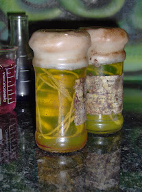
I'm not totally clear on what a "Mantipi" is, but Crafterella has a good tutorial on making one. While her approach to making a "thing in a bottle" is a bit whimsical the step by step directions are clear and concise.
If you've never tackled a prop project before I'd recommend giving this one a try, if only because it's almost impossible to make a bad bottled specimen. Even if you think it looks absolutely terrible all you have to do is add another drop or two of dye to the water and it suddenly looks all mysterious and spooky. Once you're comfortable with the basic techniques all kinds of possibilities open up because of the unique nature of the presentation. A bottle filled with fluid will naturally magnify objects in certain locations, while adjustments to the fluid and label placement allow you to hide and obscure other areas.
Update: Duh. I just realized a mantipi is a cross between a man and an octopi, something that was staring me right in the face.
Sanitarium Escapee
My thanks to Dark in the Dark for the very kind writeup of the Arkham Sanitarium project. Be sure to browse around while you're there. The classic pulp covers are a delight.
Monday, October 25, 2010
Cthulhu Fhtagn! Lerche Edition
Intentionally avoiding a more anthropomorphic depiction, artist Anders Lerche sculpted this squid inspired Cthulhu bust.
Crass Commercialism
I have another bottled specimen that you may enjoy up on Ebay. The last few examples I've posted were made using a new slush mold technique that allows a lot of detail at a very small scale. The head in the closeup shot is only an inch across.
Sunday, October 24, 2010
Creepy Crawlies
Graham Bartram produced these nicely done bottled specimens and sent over some helpful tips:
If you're interested in making your own you'll find some helpful information here and here. My thanks to Mr. Bartram for sharing his work.
"I've made my first couple of bottled specimens and attached a couple of photos to so you can take a look. I hope you like them.
What a learning experience that was. In hindsight I can see a couple of things I could have done better and I made a couple of observations to remember for the future. Things to improve include buying a better pen in order to give me a nicer cursive script, I was amazed at how many of my pens are not truly water proof too. :/
Observation wise I noticed that the longer I left the latex, the smoother the worm. If it's still quite tacky I found I got holes that resulted in a more degraded tissue effect, that's useful of course, sometimes a degraded tissue effect looks better. I also found that chalk dust and colored chalk dust gave a different effect. Not so dirty but more dusty if you see what I mean. The colored dust gives a more chemical environment look.
I had to use a walnut ink pad for the label as I couldn't get the crystals but I have them on order and they will be in this week. I look forward to that.
Wax microwaved well too I found , no need for a double boiler but the pyrex jug I used does get a bit hot and it needs stirring every 30 seconds or so."
If you're interested in making your own you'll find some helpful information here and here. My thanks to Mr. Bartram for sharing his work.
Saturday, October 23, 2010
The Book of Eibon
Brazilian artist Leo Dias brings us this well done recreation of "The Book of Eibon", commissioned for an indy horror film. The weathering is fantastic.
Friday, October 22, 2010
To the Ends of the Earth
Continuing the serendipitous theme of adventuring gear, Laurent Gontier sent over a few shots of his own prop collection. You can see more of his work at his website (in French).
I like these presentations so much because they capture a little of the adventuring spirit of a bygone era. It's amazing how an artfully collected series of objects can fire the imagination.
Thursday, October 21, 2010
A Day in the Life
"What are you doing tonight?"
"I didn't have any plans, but I have to pre-tension my worm."
Silence. Followed by snickering. Followed by...
"You know what day it is?"
When your significant other says that there's a good chance you've totally forgotten an event like a birthday or anniversary. Suddenly I could hear Admiral Ackbar yelling "It's a trap!", followed by a quick rundown of the important dates on the friends and family calendar in my mind. I couldn't think of anything we should be celebrating today.
"Hello? Something that happened three years ago? Tentacles? The reason you steal my craft supplies?"
Today is Propnomicon's third anniversary, and it totally slipped my mind. Heh.
The Adventuring Life
CoastConFan has posted an intriguing collection of vintage gear and artifacts. The picture itself was taken in 1986, while some of the items (like the gigantic Gasser revolver) predate that by a century or more.
Wednesday, October 20, 2010
Blood Will Tell
Eric Hart has a great article on "The Gore of Grand Guignol". It's interesting from both a historical perspective and as an example of the kind of effects that are possible using relatively simple materials and a healthy dose of creativity and stagecraft.
"The fan of both horror and theatre is sure to have heard of Grand Guignol. Though a producer of a variety of works, the infamous Parisian theatre is best known for its horror plays performed in the years leading up to World War II. Founded in 1894 by Oscar Méténier, Le Théâtre du Grand-Guignol offered up stories such as Le Laboratoire des Hallucinations, by André de Lorde: A doctor performs gruesome brain surgery his wife’s new-found lover. The man is turned into an insane zombie and plunges a chisel into the doctor’s brain. Anyone familiar with EC Comics will recognize the kind of plots this theatre performed.
When a theatre regularly displays amputations, burning in acid, eviscerations, stabbings and all other manner of violent actions, a prop person may ask: how realistic were these effects, and how were they pulled off?"
Blasphemous Tomes
Yesterday's look at a small part of Nick Storm's extensive collection featured an impressive tome. It turns out that it's a copy of "De Vermis Mysteriis" created by Anchorhead Books , and what's inside is just as well crafted as the outside. Their Flickr account has detailed photos of the book's interior and inserts.
I feel a bit guilty that I haven't featured them before this, since I regularly troll Flickr for interesting props. The fact that work like this was able to escape my notice is a little embarrassing.
Tuesday, October 19, 2010
Investigator's Gear
Nick Storm has one of the largest collections of Mythos props extant, and he was kind enough to send over these shots of a few of them in his study.
I love seeing props displayed with period items like the typewriter and Davis-style compass. The purple and silver Cthulhu figurine is one of my wayward children- I did it about fifteen years ago. It took hours of sanding to get to get that smooth finish.
A closer look at the Cthulhu idol, and in the background a beautiful workingYale Eveready hand light. I'm a vintage flashlight junkie, and the Yale models from the 1920s exemplify what would have been carried by Mythos investigators. There's a good chance the one pictured is identical to the one carried by the protagonist of "The Shadow Over Innsmouth".
Update: Mr. Storm left a comment regarding the display that somehow ended up in the Arkham Sanitarium post. I've taken the liberty of copying it here, since it has some interesting information about the items.
I love seeing props displayed with period items like the typewriter and Davis-style compass. The purple and silver Cthulhu figurine is one of my wayward children- I did it about fifteen years ago. It took hours of sanding to get to get that smooth finish.
A closer look at the Cthulhu idol, and in the background a beautiful working
Update: Mr. Storm left a comment regarding the display that somehow ended up in the Arkham Sanitarium post. I've taken the liberty of copying it here, since it has some interesting information about the items.
"As to the comments about the accoutrements on the table:
And the Mysteries of the Worm Tome -it was indeed an online auction purchase.I am a collector.....
VINTAGE PORTABLE FOLDING SMITH-CORONA No. 3 TYPEWRITER
Serial # 453976
This typewriter is unique not only because it folds up, but in that each key is capable of typing lower case, upper case, and a symbol. Yes, that's right THREE different functions for each key.
OK, I know you collectors out there are well aware of this, but I was impressed when I saw it, as well as the fact that the shift key raises the carriage instead of the striking keys. This is really a magnificent example of early 20th century engineering and manufacturing.
According to the serial number, this unit was manufactured in 1922 - This could have been used to type shopping lists for Al Capone, or the peace agreement between Joe Masseria and Umberto Valenti right before Umberto was gunned down in the street. Heck, maybe Calvin Coolidge or Herbert Hoover penned speeches with it, or perhaps Groucho Marx read scripts that were typed on it, or maybe W.C. Fields spilled a drink on it while Mae West serviced him? Of course, it could have also simply belonged to a regular Joe, but who knows?
1924 EVEREADY 2 “D” cell black painted flashlight. Domed fish-eye glass. On / off push button that also slides forward to lock into the always on position. VERY similar design style to the Yale or vice versa."
Monday, October 18, 2010
Arkham Sanitarium Update
The Arkham Sanitarium prop project is almost over.
The last of the prop sets were mailed out this morning, with the exception of two donors that haven't responded to the Kickstarter request for address information. If you haven't received an email confirming that your package was posted please check your spam filter.
If you encounter any problems please don't hesitate to contact me. I take your satisfaction extremely seriously. Your positive experience is the only advertising I have, so I want you to be absolutely bubbling over with enthusiasm for the next project to come down the pipe.
Geedunk Props
Michael Fanara of Geedunk Props has released an impressive library of handouts for a variety of published "Call of Cthulhu" adventures. The PDFs include a smorgasbord of newspaper clippings, handwritten notes, letters, and more.
Propapalooza!
I generally avoid hawking my wares too much here on the blog, but the rather spectacular death of my car's engine on Friday afternoon compels me to raise a ridiculously large sum of money in a short amount of time.* Hence the "Propapalooza", a week long garage sale of all sorts of prop oddities on Ebay.
You can check out everything over here. There will be some interesting bits and bobs available, including period gear from my collections of "At the Mountains of Madness" and "The Shadow Out of Time" related items.
* Demonstrating that my fears of something going horribly wrong in the middle of a prop project were well founded. Luckily, this disaster happened right at the end of the Arkham Sanitarium project and won't impact it in the slightest.
Sunday, October 17, 2010
The Black Duke's Tome
Rev. Marx has been creating a series of props for the indy film "The Black Duke", and his latest installment of the build process details the final finishing of a massive occult tome.
Saturday, October 16, 2010
Moonstone Totem
Artist "pj925" brings us this totem necklace crafted from silver and bronze. Semi-precious moonstones are mounted on either end.
It caught my eye because of the resemblance to Tóbal's reliquary from earlier this week. It just looks like an amulet or occult artifact- mysterious and unfathomable. There's a part of me that always feels a little guilty pointing to the work of an artist and saying "This would make a great prop", but I mean it as a genuine compliment. It's just not as long-winded as "This object's enigmatic purpose fires the imagination, evoking a sense of wonder via the inscrutability of its design".
Friday, October 15, 2010
Arkham Sanitarium Update
The lapel pins finally arrived yesterday and they look awesome. Now that everything is in hand I've started mailing out the complete prop sets to patrons in order of their initial donation to the Arkham Sanitarium project. Twenty packages are already in the mail, and at least that many should go out today.
Here's a look at what you'll be receiving:
Each set includes 1 embroidered patch, 1 enamel lapel pin, 1 Moleskine-style pocket notebook, 5 postcards (the two Sanitarium cards and three extras from previous projects), and 2 patient file folders.
Here's an extreme closeup of the lapel pin. For something that is only 1" across the level of detail is remarkable.
Out of all the items in the set the pin is my favorite. Despite the delays in it's manufacturing the final product is absolutely outstanding.
Thursday, October 14, 2010
Arkham Sanitarium Patient File
The industrious Mr. Able of the Able workshop, the alter ego of artist Julian DiMarco, sent over these shots of his Arkham Sanitarium patient file. All of the documents he used are available here under the "Arkham Sanitarium" label, and he has some helpful advice for finishing them off.
I prefer to reproduce handwriting by hand, but I think his approach of using computer generated text has some huge advantages. The sad truth is that I have terrible handwriting and normally have to coerce my significant other into doing any prop writing I need. Based on my conversations with some other prop creators this isn't an unusual situation. Not to launch a huge debate on learning and manual dexterity development, much less my potential sexism, but I think the methods used to teach cursive writing, and the age at which it's taught, aren't as effective with boys as girls.*
One of the advantage of forms like these is that a handwriting font isn't as jarring as it would be in something like a letter. The clearly marked lines and regularity of the entries make the inhuman precision of a digital font far less noticeable. A handwritten note requires some subtle misalignments and jitter to look natural.
Mr. Able also brings up a good point about layering and it's impact on sense impression. Traditional theatrical and film props are primarily concerned with looking good, but well done live action props are so effective because they embrace all the senses. One of the reasons I produced so many different documents for the Arkham Sanitarium project is to make it easier to produce a visually and tactiley interesting final product.
* Harriet Hanlon, Robert Thatcher, and Marvin Cline. Gender differences in the development of EEG coherence in normal children. Developmental Neuropsychology, 16(3):479-506, 1999**
** Sweet fancy Moses, I'm footnoting a throwaway comment in a discussion of fake patient files. I need help.
"I used Photoshop to make the text with my laser printer on the form - I then took the form, attached a photo I printed out on photo paper to it, and then ran the whole shebang through an inkjet printer to get the 'stamp' effect. I was going for a really textural feel with the medical file - I tried as much as I could to work through the 'process' of how a file would be treated and the physical feel of it different papers used for different documents - a lot of times I see pictures or stamps and the like that are all printed in one layer...there's no sensation there."
I prefer to reproduce handwriting by hand, but I think his approach of using computer generated text has some huge advantages. The sad truth is that I have terrible handwriting and normally have to coerce my significant other into doing any prop writing I need. Based on my conversations with some other prop creators this isn't an unusual situation. Not to launch a huge debate on learning and manual dexterity development, much less my potential sexism, but I think the methods used to teach cursive writing, and the age at which it's taught, aren't as effective with boys as girls.*
One of the advantage of forms like these is that a handwriting font isn't as jarring as it would be in something like a letter. The clearly marked lines and regularity of the entries make the inhuman precision of a digital font far less noticeable. A handwritten note requires some subtle misalignments and jitter to look natural.
Mr. Able also brings up a good point about layering and it's impact on sense impression. Traditional theatrical and film props are primarily concerned with looking good, but well done live action props are so effective because they embrace all the senses. One of the reasons I produced so many different documents for the Arkham Sanitarium project is to make it easier to produce a visually and tactiley interesting final product.
* Harriet Hanlon, Robert Thatcher, and Marvin Cline. Gender differences in the development of EEG coherence in normal children. Developmental Neuropsychology, 16(3):479-506, 1999**
** Sweet fancy Moses, I'm footnoting a throwaway comment in a discussion of fake patient files. I need help.